STC Website Redesign Project

Introduction
The Society for Technical Communication (STC), which closed in 2025 due to financial difficulties, was a professional organization for practitioners within the Technical Communication field. At the time of this project, STC officials were deliberating different options for the redesign of the website. The reasons for this deliberation were due to the increase in complaints from users of the website at the time. These complaints included:
The website being out of date
Difficult to navigate
Overall poor user experience
The board solicited our team’s help in conducting a usability test of the current website, as well as providing wireframes and prototypes that solve these pain points.
User Interviews and Initial Usability Testing:
The team collectively reached out to Technical Communication practitioners and those within the field to interview them regarding the current state of the STC website at the time of the project beginning. Using the UserTesting website, we were also able to conduct a self-administered usability test which gave user further insight into the pain points that users experienced while using the STC website.
After interviews with practitioners and the usability testing, we were able to identify several issues and pain points that users were experiencing while using the website:
Pages are lengthy and wordy
Lack of visuals throughout the page
Overwhelming homepage (due to the previous two pain points)
The top navigation bar is difficult to use
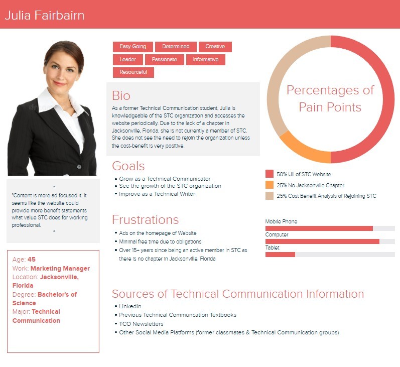
In understanding this information from the interviews and usability testing, we developed 4 different personas. An example of one is shown below:
Website Redesign Wireframe and Prototype:
With the identification of these issues and pain points, we started to work on the redesign of the website. Initially, we started with wireframes that served as our initial ideas for the redesign.
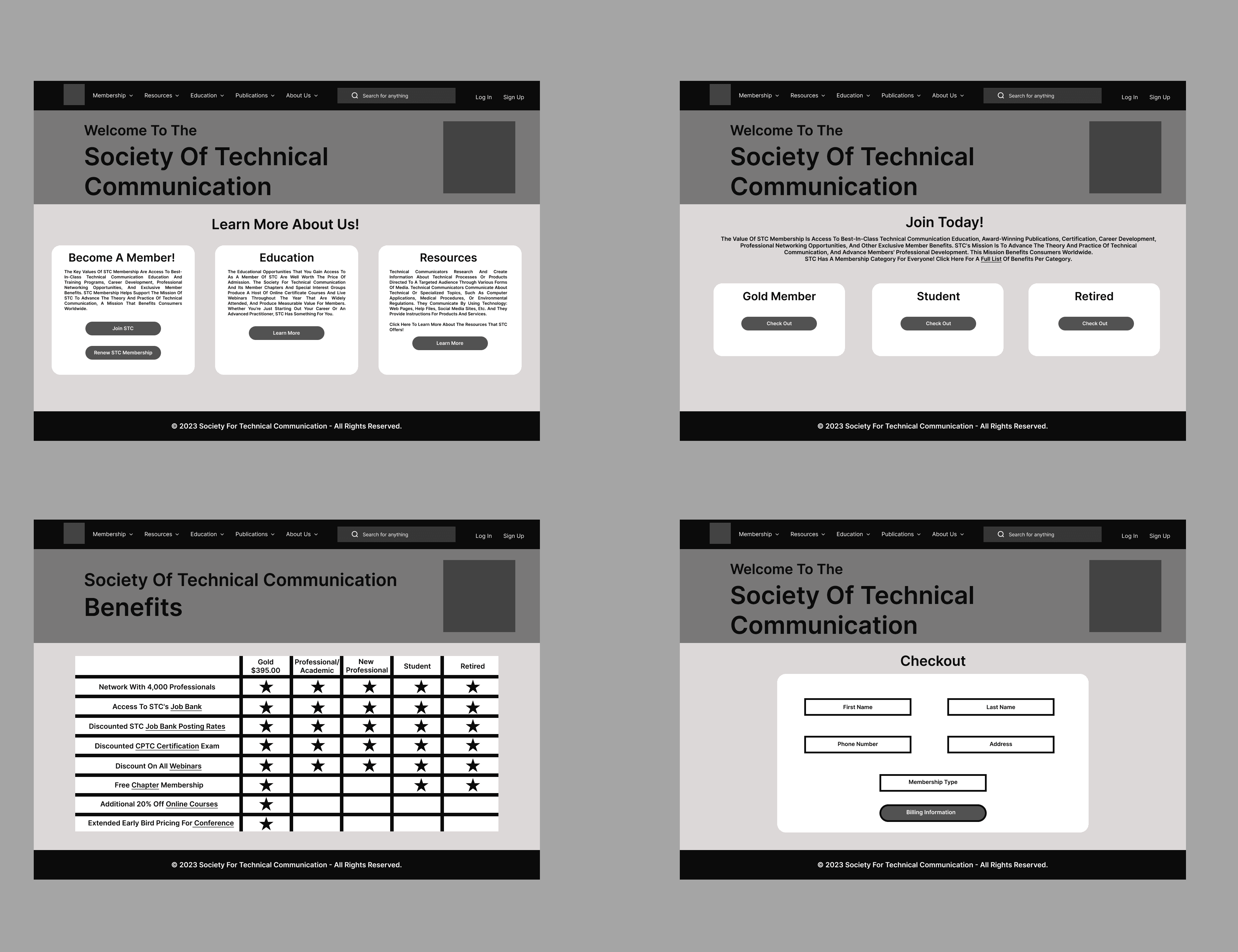
Our Designs focused on the following:
Adding more white space to the site
Making the site design and layout more consistent
Fixing the visual hierarchy and shortening text
Adding more visuals

Usability Testing
After the prototype was completed, we tested the prototype with three participants. The assessment methods for the user testing included:
Pre-test interview: To gauge users thought processes prior to the usability test
Usability testing: Understand user interaction when participants interacted with the prototype
Think Aloud-Protocol: to observe what the user is thinking as they are interacting with the site
Task Completion: to assess how efficient the site was
Post-test interview: To understand participants’ feelings on the usability test while gathering user feedback
Conclusion:
Based on usability testing and user feedback, the team provided several key recommendations that have been identified to enhance the overall user experience of the STC website:
Simplify Navigation: Users need a more intuitive path to locate articles and resources relevant to their field. Organizing content into clearly defined categories with concise, meaningful labels will help streamline navigation and reduce cognitive load.
Streamline the Homepage: The homepage should prioritize clarity and accessibility. By removing unnecessary elements and highlighting core features—such as event calendars and key publications—the site can better guide users to the content they value most.
Surface Relevant Content: To support task efficiency, frequently accessed resources and popular content should be prominently featured. Introducing filtering and search functionalities will further empower users to quickly locate what they need.
Enhance Label Clarity: Clear, descriptive labels for navigation and content are essential to minimizing user confusion. For example, the redesigned Database Building page now clearly communicates its purpose and content, reducing ambiguity and improving user confidence.
These recommendations aim to make the STC site more user-centered, ultimately supporting a more seamless and satisfying browsing experience.
To view the prototype or UX strategy kit that the team created, click on the link below:
UX Strategy Kit Link: https://docs.google.com/presentation/d/1sV9eyInF5A5cUzKvczlWulCdIw-I8Jeu7sF_WC86r6Q/edit?usp=sharing